Category: Data Science Methodology
Under the Curve: A primer on kaggle competitions
Variance: regression, clustering, residual and variance – Liyun Chen ’11
 Liyun Chen ’11 (Economics) is Senior Analyst for Data Science at eBay. She recently moved from the company’s offices in Shanghai, China to its headquarters in San Jose, California. The following post originally appeared on her economics blog in English and in Chinese. Follow her on Twitter @cloudlychen
Variance is an interesting word. When we use it in statistics, it is defined as the “deviation from the center”, which corresponds to the formula  , or in the matrix form
  (1 is a column vector with N*1 ones). From its definition it is the second (order) central moment, i.e. sum of the squared distance to the central. It measures how much the distribution deviates from its center — the larger the sparser; the smaller the denser. This is how it works in the 1-dimension world. Many of you should be familiar with these.
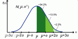
Variance has a close relative called standard deviation, which is essentially the square root of variance, denoted by  // . There is also something called the six-sigma theory– which comes from the 6-sigma coverage of a normal distribution.
Okay, enough on the single dimension case. Let’s look at two dimensions then. Usually we can visualize the two dimension world with a scatter plot. Here is a famous one — old faithful.
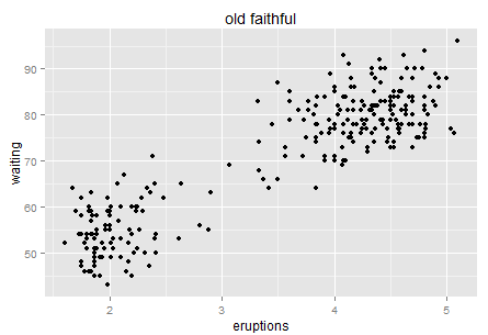 Old faithful is a “cone geyser located in Wyoming, in Yellowstone National Park in the United States (wiki)…It is one of the most predictable geographical features on Earth, erupting almost every 91 minutes.” We can see there are about two hundreds points in this plot. It is a very interesting graph that can tell you much about Variance.
Here is the intuition. Try to use natural language (rather than statistical or mathematical tones) to describe this chart, for example when you take your 6 year old kid to the Yellowstone and he is waiting for next eruption. What would you tell him if you have this data set? Perhaps “I bet the longer you wait, the longer next eruption lasts. Let’s count the time!”. Then the kid has a glance on your chart and say “No. It tells us that if we wait for more than one hour (70 minutes) then we will see a longer eruption in the next (4-5 minutes)”. Which way is more accurate?
Okay… stop playing with kids. We now consider the scientific way. Frankly, which model will give us a smaller variance after processing?
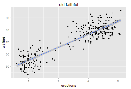
Well, always Regression first. Such a strong positive relationship, right? ( no causality…. just correlation)
Now we obtain a significantly positive line though R-square from the linear model is only 81% (could it be better fitted?). Let’s look at the residuals.
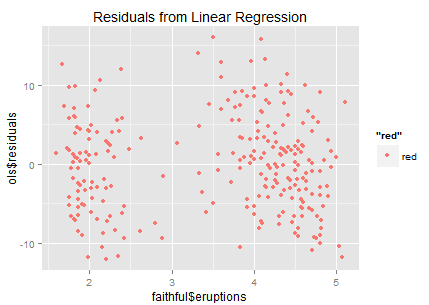 It looks like that the residuals are sparsely distributed…(the ideal residual is white noise which carries no information). In this residual chart we can roughly identify two clusters — so why don’t we try clustering?
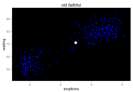
Before running any program, let’s have a quick review the foundations of the K-means algorithm. In a 2-D world, we define the center as  // , then the 2-D variance is the sum of squares of each pint going to the center.
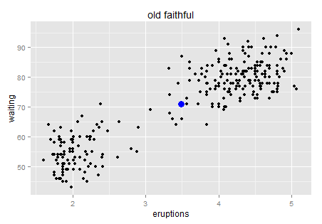 The blue point is the center. No need to worry about the outlier’s impact on the mean too much…it looks good for now. Wait… doesn’t it feel like the starry sky at night? Just a quick trick and I promise I will go back to the key point.
For a linear regression model, we look at the sum of squared residuals – the smaller the better fit is. For clustering methods, we can still look at such measurement: sum of squared distance to the center within each cluster. K-means is calculated by numerical iterations and its goal is to minimize such second central moment (refer to its loss function). We can try to cluster these stars to two galaxies here.
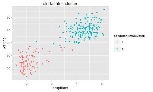 After clustering, we can calculate the residuals similarly – distance to the central (represents each cluster’s position). Then the residual point.
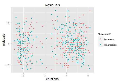 Red ones are from K-means which the blue ones come from the previous regression. Looks similar right?… so back to the conversation with the kid — both of you are right with about 80% accuracy.
Shall we do the regression again for each cluster?
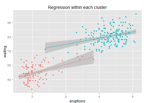 Not many improvements. After clustering + regression the R-square increases to 84% (+3 points). This is because within each cluster it is hard to find any linear pattern of the residuals, and the regression line’s slope drops from 10 to 6 and 4 respectively, while each sub-regression only delivers an R-square less than 10%… so not much information after clustering. Anyway, it is better than a simple regression for sure. (the reason why we use k-means rather than some simple rules like x>3.5 is that k-means gives the optimized clustering results based on its loss function).
Here is another question: why do not we cluster to 3 or 5? It’s more about overfitting… only 200 points here. If the sample size is big then we can try more clusters.
Fair enough. Of course statisticians won’t be satisfied with these findings. The residual chart indicates an important information that the distribution of the residuals is not a standard normal distribution (not white noise). They call it heteroscedasticity. There are many forms of heteroscedasticity. The simplest one is residual increases when x increases. Other cases are in the following figure.
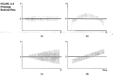 The existence of heteroscedasticity makes our model (which is based on the training data set) less efficient. I’d like to say that statistical modelling is the process that we fight with residuals’ distribution — if we can diagnose any pattern then there is a way to improve the model. The econometricians prefer to name the residuals “rubbish bin” — however it is also a gold mine in some sense. Data is a limited resource… wasting is luxurious.
Some additional notes…
Residuals and the model: as long as the model is predictive, then residuals exist, regardless of the model’s type, either a tree or linear or whatever. Residual is just the true Y minus the prediction of Y (based on training data set).
Residuals and loss function: for ordinary least squares, if you solve it in the numerical way then it iterates by the SSR (sum of squared residuals) loss function (equals to the variance of residuals). In fact many machine learning algorithms relay on a similar loss function setting — either first order or higher order moments of residuals. From this perspective statistical modelling is always fighting with residuals. This differs from what the econometricians do so there was a huge debate on the trade off between consistency and efficiency. Fundamentally different believes of modelling.
Residuals, Frequentists and Bayesians: In the above paragraphs I mainly followed the Frequentist’s language. There was nothing on posterior… From my understanding many items there would be mathematically equivalent to the Bayesian’s frameworks so it should not matter. I will mention some Bayesian ideas in the following bullets so go as you wish.
Residuals, heteroscedasticity and robust standard error: We love and hate heteroscedasticity at the same time. It tells us that our model is not perfect while there is a chance to make some improvements. Last century people tried to offset heteroscedasticity’s impact by introducing the robust standard error concept — Heteroscedasticity-consistent standard errors, e.g. Eicker–Huber–White. Eicker–Huber–White changes the common sandwich matrix (bread and meat) we use for the significant test (you may play with it using the sandwich() package in R). Although Eicker–Huber–White contributes to the variance estimation by re-weighing with estimated residuals, this approach does not try to identify any patterns from the residuals. Thus there are methods like Generalized least square (GLS) and Feasible generalized least square (FGLS) that try to use a linear pattern to reduce the variance. Another interesting idea is clustered robust standard error which allows heterogeneity among clusters but constant variance within each cluster. This approach only works when the number of groups approaches infinite asymptotically. (otherwise you will be getting stupid numbers like me!)
Residuals and reduction of dimensions: generally speaking the more relevant co-variates introduced to the model the less the noise is; while there is also a trade-off towards overfitting. That is why we need to reduce the dimensions (e.g. via regularization). Moreover, it is not necessary that we want to make a prediction every time; sometimes we may want to filter out the significant features — a sort of maximizing the information we could get from a model (e.g. AIC or BIC or attenuation speed which increasing the punishment in regularization). In addition regularization is not necessarily linked to train-validation… not the same goal.
Residuals and experimentation data analysis: heteroscedasticity will not influence the consistency of Average Treatment Effect estimation in an experimentation analysis. The consistency originates from randomization. However people are still eager to learn more beyond a simple test-control comparison, especially when the treated individuals are very heterogenous; they look for heterogenous treatment effect. Quantile regression may help in some case if there is a strong covariate observed…but what could we do when there are thoudsands of dimensions? Reduce the dimension first?
Well, the first reaction to “heterogeneous” should be variance…right? otherwise how could we quantify heterogeneity? There is also a bundle of papers that try to see whether we would be able to find more information for treatment effects rather than simple ATE. This one for instance:
Ding, P., Feller, A., and Miratrix, L. W. (2015+). Randomization Inference for Treatment Effect Variation. http://t.cn/RzTsAnl
The global network of payment flow – Barcelona GSE Data Scientists
Originally posted by Jordi Zamora ’15 on the Barcelona GSE Data Scientists blog.
The study focused on understanding the underlying structure of a network of messages between financial institutions in different countries. It looked at how the network was affected by various recent economic events and evaluated the robustness of the system over time.
The data set underpinning the study contains standard MT103 SWIFT messages from 1 January 2003 and 31 July 2013, a period characterised by extreme economic turmoil. Each message represents a single customer credit transfer from bank to bank. The data is aggregated at the country level.
Samantha showed us different statistical analyses of the data set. The analysis of the data in terms of a complex weighted network was particularly interesting. In the network, each node represented a country and the edges connecting two different nodes were weighted according to the amount of messages those country exchanged in a given time period. The resulting network follows approximately a Core-Peripheral structure, that is, some nodes are fully connected with each other (the so-called core) while some others are mostly connected only to a node of the core: these are the peripheral nodes. Interestingly, events such as the introduction of new regulations or the beginning of the financial crisis was clearly reflected in the links and even more striking this network structure was resilient during the period studied. This work showcases a novel approach to understanding the structure of the complex financial system and the findings may provide a way to help improve the global service.
The discussion also identified some opportunities for further research. For example, we discussed why the degree distribution does not behaves as other related financial networks, and why the number of links decreases while the number of messages has a clearly increasing trend. These questions, and others that emerge, may provide ideas for further research and modelling work in this area.
Can big data be official? – Barcelona GSE Data Scientists
Originally posted by Stefano Costantini ’15 on the Barcelona GSE Data Scientists blog. Stefano is on Twitter @stefanoc.
Originally posted by Stefano Costantini ’15 on the Barcelona GSE Data Scientists blog. Stefano is on Twitter @stefanoc.
At the Renyi Hour on November 13th 2014, Frederic Udina gave a talk on big data and official statistics. Apart from being a professor at UPF and BGSE, Frederic is Director of IDESCAT, the statistical institute of Catalonia.

In his talk, Frederic compared the “traditional” official statistics – slow to produce, with well-defined privacy limits and access rights – to “big data”, which is fast to produce, volatile and with fuzzy privacy limits. Frederic highlighted the tension between these two worlds, focusing particularly on the need for official statistics to become easier to collect, organise and customise to the need of the final user. In particular, Frederic identified the opportunity for IDESCAT (and other statistical institutes) to integrate the officially collected information with alternative information sources, such as:
- Administrative data
- Data freely available from the society
- Data from private companies
Frederic outlined IDESCAT’s plan to move away from the current data generation system (the ‘stove pipe model’) which is slow, expensive and inefficient as it does not re-use information already collected, towards a fully integrated model (‘Plataforma Cerdà’) where any new information needs to be integrated with existing data.

Frederic noted that data is becoming increasingly important in society, and this is beginning to be recognised by official statistical institution. In particular, Frederic discussed the Royal Statistical Society’s Data manifesto where the RSS notes that data is:
- A key tool for better, informed policy-making
- A way to strengthen democracy and trust
- A driver of prosperity.

Frederic also stressed the importance of confidentiality and privacy issues with regards to data availability. While it is desirable for some data to be freely available to the public, confidentiality and privacy should always be protected. However, it is important to strike the right balance between access and privacy, ensuring that while personal sensitive data is protected, important information is not prevented from being used in ways that may ultimately help the wider society. Personal health records are a classic example of this.
Frederic concluded his talk by providing some example of national statistical authorities integrating official statistics with widely available information to carry out new interesting analysis. Examples include:
- Production of origin/destination arrays between territorial units (usually municipalities) for working or studying reasons using trajectories of mobile phones (ISTAT, New Zealand Statistics)
- Using Google Trends to estimate/predict labour market, monthly forecast, small-area estimation (ISTAT)
- Measuring use of TCI in firms, by using web scraping and text mining techniques

Useful links:

